The Brand Shop is a medium and Responsive WooCommerce WordPress Theme for boutique, clothes store, fashion store, makeup products or similar websites that needs a functional yet outstanding online presence.
This theme includes cool features such as Premium Visual Composer page builder, WooCommerce Currency Switcher, Mega Menu support, YITH WooCommerce Compare, YITH WooCommerce Wishlist.
The Brand Shop ensures that you will have more time finding and selling products and less time managing your website. Choose The Brand Shop and make your dream store a success!
If you like this template...
Please Don’t Forget to Rate it!
Theme Features
Responsive – This theme is responsive to give a perfect user experience on all devices.
One Click Demo Import – Easiest and fastest way to build your website, one click import pages, post, revolution slider, widgets, theme options and more!
Boxed or full width layout – This can be set globally or even per page!
Built on Twitter Bootstrap – The Brand Shop uses Twitter Bootstrap. This means that a range of shortcodes are automatically supported. For ease of use you can use the Visual Composer, Easy Bootstrap Shortcode or any other plugin to easily add visuals to your website.
WooCommerce plugin included – This is the most popular WordPress eCommerce plugin. And it's available for free. Packed full of features, perfectly integrated into your self-hosted WordPress website.
WooCommerce Currency Switcher plugin included – This theme includes the WooCommerce Currency Switcher plugin, saving you $17.
YITH WooCommerce Compare plugin included – Make your customers' life easier and allow them to make a comparison among your products in the easiest and most efficient way ever: with a few clicks, they will get an overview on everything you offer and they will be able to choose what best meets their needs.
YITH WooCommerce Wishlist plugin included – The wishlist is one of the most useful feature of an e-commerce: on one side, it encourages users to come back, allowing products tracking they consider interesting until the purchase step. On the other, if users share their wishlist — to friends, or through social networks — this will enhance the sales and will help the promotion of you online business.
Visual Composer plugin included – This theme includes the Visual Composer plugin, saving you $33.
Mega Menu Support.
Built with Less .css
Shortcode Support.
Unlimited Color Options.
Moveable & Unlimited Sidebars – Move the sidebar to the left, the right, or hide it entirely for a full width page or post! (global or page/post specific).
Designed with HTML5 and CSS3.
Customizable Design & Code.
All installed Extensions are included.
Easy to use Theme Options Panel.
Cross Browser Support.
Detailed Documentation Included.
Full Support.
+ many more features.
More features coming soon.
Installing the Theme
Installing The Brand Shop Theme
Note: Before beginning the installation and configuring of your new theme, you must first have WordPress already installed on a server.
You can watch this video tutorial on how to install Wordpress.
You can install this WordPress theme using two installation methods:
Using WordPress Administration Panel.
Copying theme files via FTP.
METHOD 1
Using thebrand.zip found in ZIP file you downloaded from ThemeForest.com you should perform the following steps:
Login to WP admin.
Go to Appearance > Themes option and click on it to load new page.
Select Install Theme tab at the top of the panel to load new page.
Click on Upload option at the top of the panel to load new page.
Click on Browse button and locate thebrand.zip on your file system.
Go to Appearance > Themes option and click on it to load new page.
Once installation is complete you can activate The Brand Shop theme.
This video tutorial will show you how to install new The Brand Shop Theme.
METHOD 2
NOTE: If you are using FileZilla, make sure to fix it as described below before you copy the files:
Using The Brand Shop directory found inside of thebrand.zip file located inside ZIP file you downloaded from ThemeForest.com you should perform the following steps:
Using FTP client you should login to server where your WordPress web site is hosted.
Using FTP client you should navigate to /wp-content/themes/directory under your WordPress web site’s root directory.
Using FTP client upload thebrand directory to themes directory on remote server.
Once installation is complete you can activate thebrand theme.
Importing Demo Content
One Click Install Demo Data
Note: Please, click Import button and wait about 2 - 3 minutes. If it spins, please, click again then waiting about 2 - 3 minutes. Importing will be done successfully.
How to Active and Import Data The Brand Shop Theme One Click.
After importing success, select homepage:
If you would like to learn the best practice of using The Brand Shop theme, you can import content from our demo web site. Importing theme is performed using XML file located in theme ZIP file downloaded from ThemeForest and following these steps:
Install plugin:
Install Wordpress Importer Plugin.
Install Widget Settings Importer/Exporter Plugin.
Content import:
Select import type wordpress.
Select file sample.xml from package.
Assign author and select import attachments.
Import completed.
Widget setting import:
Select file widget_data.json from package.
Import completed.
Slicder import:
Options import:
Open and copy content file file option.json for importing from package.
Import completed.
Setting page display and assign menu:
Select front page display.
Assign menu.
Upgrading The Brand Shop Theme
NOTE: If you are using FileZilla, make sure to fix it as described below before you copy the files:
You can upgrade our theme by performing following steps:
Download latest theme zip file from ThemeForest.
Extract it and locate thebrand.zip.
Extract thebrand.zip and locate The Brand Shop folder.
Copy/Replace the content of thebrand folder to /wp-content/themes/thebrand folder of your web site.
Feel free to ask us any questions about using features The Brand Shop theme offers.
Increasing the upload_max_filesize in WordPress via php.ini
The default upload file size for WordPress is 2 MB, which is a problem if you want to upload a large media files. If you get this error, "The uploaded file exceeds the upload_max_filesize directive in php.ini", follow these steps:
Locate the php.ini file inside the wp-admin directory.
Find this line in the php.ini file "upload_max_filesize = 2M" and replace it with a higher value (e.g. "upload_max_filesize = 64M").
You may also want to increase your max post size. Look for this line in your php.ini file "post_max_size" and increase it as well.
Save the changes to the file inside your wp-admin directory.
Try the upload again.
If you still have issues, look for this file in your root directory and make the same changes.
Increasing the upload_max_filesize in WordPress via .htaccess
If you get this error, "The uploaded file exceeds the upload_max_filesize directive in php.ini", follow these steps:
Locate the .htaccess file inside the root directory or installed folder.
Open or create the .htaccess file in the root folder and add the following code:
The options panel is home to all of the theme's extensive configuration options. To view the panel, navigate to 'Theme Options' in the left-hand menu. Here you have the ability to alter many core aspects that make up how your theme looks and behaves. Any of the options that have some ambiguities to them conveniently have descriptions to explain their purpose.
Editing & Creating Content
Changing Your Logo:
Select the Theme Options > Logo option from your WordPress admin.
Click on the Upload button to bring up the WordPress image uploader.
Choose the image if you've already uploaded it or upload the image for the first time.
Click on the Save All Changes button to save your new theme settings.
NOTE: You should use a .png image
Changing Your Favicon:
Select the Theme Options > Favicon option from your WordPress admin.
Click on the Upload button to bring up the WordPress image uploader.
Choose the image if you've already uploaded it or upload the image for the first time.
Click on the Save All Changes button to save your new theme settings.
NOTE: You can create a favicon using Photoshop. Create a 16x16 pixels image and save it as favicon.png or favicon.gif.
This video tutorial will show you how to change the logo and favicon on your new The Brand Shop install.
Widgets
The Brand Shop Theme comes with following custom widgets:
Flexibility customized font
By default, the template loads this font from Standard Font, you can change the font with the one that suits you best.
Shortcodes
Pages/Posts are built using shortcodes accessed by clicking The Brand Shop menu in the top right of the Add new Element . All shortcodes are in menu listed alphabetically.Head Section.
WooCommerce
WooCommerce is the most popular WordPress eCommerce plugin. And it's available for free. Packed full of features, perfectly integrated into your self-hosted WordPress website.
WooCommerce
Transform your WordPress website into a thorough-bred eCommerce store. Delivering enterprise-level quality and features whilst backed by a name you can trust. Say "hello" to the WooCommerce eCommerce plugin.
If you need dedicated support for this component, please visit: Documentation
WooCommerce 101 Video Series
WooCommerce Currency Switcher - This theme includes this plugin, saving you $17.
WooCommerce Currency Switcher – is a plugin that allows you to switch to different currencies and get their rates converted in the real time – must have plugin for your WooCommerce powered online store! Currency Switcher is available as a with shortcode so and with widget.
The Plugin Features:
Shortcode - just add in text widget [woocs width='100px'] OR [woocs width='50%']
Widget
3 kinds of selectors with flags + flag mode
Currency can be changed automatically according to visitor's IP using woo WC_Geolocation PHP class
3 currencies aggregators
2 currencies (in free version and more in the premium one)
The customer allowed to pay in the selected currency (not compatible for 100% with all wp themes and plugin combinations)
WooCommerce native PayPal gate ready!
Ability to set order currency which were created through admin panel by hands
Easy to use for administrators and shop customers
Compatible with WooCommerce 2.1.x and higher
Press finace.yahoo button if you want to get currency from the selected aggregator above.
Note: To update all currencies rates by one click - press radio button of the default currency and then press "Save changes" button!
New curency after clicking finace.yahoo button.
Note: To update all currencies rates by one click - press radio button of the default currency and then press "Save changes" button!
Front End:
Options: We can choose Currency aggregator from many source.
Select Options: We can choose option color and size.
YITH WooCommerce Compare
This page of the documentation contains all the information for the settings of the free version of the plugin.
Click on YIT Plugins -> Compare to access to the settings panel.
Link or Button: choose here if you want to use a link or a button to allow your users to add a product to the comparison table.
Link/Button text: the text of the link and/or the button used to add the products to the comparison table
Show button in single product page: show/hide the button in the product detail page.
Show button in products list: show/hide the button in th Shop page.
Open automatically lightbox: if this option is activated, the modal window of the comparison table will open automatically when users
will add a product for the comparison clicking on the related button.
2. Table settings
Table title: the title of the table.
Fields to show: product fields to add in the comparison table, choosing among the product information.
Repeat "Price"/"Add to cart" field: activating these options, the price and the add to cart button of each product will be replicated in
the related column in the lowest part of the table.
Image size: the size of the product images in the comparison table.
3. Widget
The YITH WooCommerce Compare widget shows the list of the products that users have added to the comparison table.
4. Menu
With the plugin you can add an entry to your menu that your users can use to open the modal window with the comparison table.
Go to the WordPress menu section, add a customized menu entry and assign it the yith-woocompare-open class.
YITH WooCommerce Wishlist
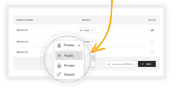
YITH WooCommerce Wishlist allows users to customise their wishlists as they prefer. First of all, they have the possibility to decide if making their own wishlist either public, shared only with whom they want, or to make it private and visible to themselves only. Moreover, the possibility to create more than one wishlists might help them in a situation such as having a wishlist shared with all members of their family but having at the same time the need for a private one where storing presents for them. Customisation is in your hands.
Then imagine users had the possibility to search among public wishlists: well, you do not have to imagine, you can do it! YITH Wishlist has an option that allows you to search within any public wishlist by simply knowing the name of its owner or the email associated to it.
YITH WooCommerce Wishlist is a useful tool put at users’ disposal, one could only benefit from the possibilities it offers. And you will be able to experience it yourself, just give a look to the demo version available here. You will be able to discover all free and premium features of it.
One of the features among the most important for me, especially if you are a shop owner, is the possibility to learn about preferences for the products you sell. It is easy to learn about it, because YITH Wishlist allows you to count the occurrences of your products in customers’ wishlists. So, for instance, this option could also allow you to discover that the product you held to be just one among many in your shop has become so trendy that it is on top of your customers’ wishes. And then, you are free to fulfil their wants by making special offers or simply manage your business the way you prefer to make your customers happy.
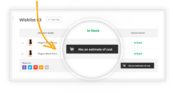
On the other side, if customers wanted to ask you for a cost estimate of the products in their wishlist, I hope you are not thinking it would be a difficult task, because it is very easy with YITH WooCommerce Wishlist. Just with a click of the mouse they can ask a cost estimate that allows them to get an idea of what is in the cart and that allows you to manage better special offers for faithful customers.
So, I personally find YITH Wishlist one of the most useful tools for anyone who has an online shop, because it allows you to offer your customers great possibilities in terms of freedom to choose products and let them have a place where to find them, even after some time has passed. Customers’ loyalty will be drastically enhanced this way and you will be able to see it on your own!
So… why waiting more? Go and try YITH WooCommerce Wishlist. It just takes you some minutes and nothing more!!!
Seclect Option before oder a product:
Mega Menu Support
Here is mega menu:
Extra Class:
4 column right side:
Revolution Slider
Create a responsive (mobile friendly) or full width slider with must-see-effects and meanwhile keep or build your SEO optimization (all content always readable for search engines). See the heaps of custom transitions/animations for each object on the page!
Customize this slider with our convenient drag & drop back-end to your every needs. This plugin features tons of unique transition effects, an image pre-loader, video embedding, auto-play that stops on user interaction and lots of easy to set options to create your own effects.
From the plugin's main admin page, select New Slider.
Enter a Slider Title and Alias
.
* The slider's Title can be anything, but the Alias should not have any special characters or spaces (but dashes and underscores are ok).
* Before saving, you can select several of the slider's settings from this page. But choosing these settings are not required to officially create a new slider, as they can be adjusted afterward.
Slider Setting Options
1.General Settings
1.1 Slider Show
Stop Slide on Hover: Stop slider progress when the user hovers their mouse over the slider.
Stop Slider After..
+ Amount of Loops: Stop the slider after all slides have looped a set amount of times.
+ At Slide: Stop the slider at a specific slide.
Shuffle / Random Mode: Stop slider progress when use hovers their mouse over the slider.
Loop Single Slide: Stop slider progress when use hovers their mouse over the slider.
Stop Slider out of Viewport: Stop slider when the page is scrolled and the slider is no longer visible.
+ Out of Viewport: Wait - Only start the slider when its scrolled into view (useful for sliders further down the page). Pause - Pause the slider when its scrolled out of view.
+ Area out of Viewport: A percentage of the slider that needs to be inside/outside the viewport before slider starts or pauses.
1.2 Defaults
Set the default individual slide settings.
For example, let’s say you always want your individual slides to start off with a “Slide to Top” transition. Adjusting the “Transitions” value will set it up so all new slides have have a “Slide to Top” transition by default.
Or if you already have individual slides created, you can change the value of “Transitions” and then select its checkbox, and then click the “Overwrite Selected Settings on all Slides” button, and the main transition for all existing slides will be changed to the new default value.
1.3 Progress Bar
The timer line that illustrates the amount of time before the next slide is shown. If active, choose the progress bar’s position (top or bottom of slider), its height in pixels, and also its color and transparency level.
1.4 First Slide
Alternative 1st Slide: Normally the slider will always start with slide #1. But if you’d like your slider to start with a different slide, enter the slide’s number here.
First Transition Active: Sometimes when your slider first starts, it’s more elegant to have a different transition such as a simple fade at the very beginning. Use this option if you’d like to specify a special, initial transition for the very first slide.
When set, the special transition will only be executed on the very first slide once. Then once the slider loops, the original slide will default back to its individual slide transition settings.
1.5 Misc
Next Slide on Focus: Browser behaviour varies when switching between windows/tabs (JavaScript stops executing, etc.). But the “Next Slide on Focus” option will often correct slider issues related to switching between tabs and windows.
2. Layout & Visual
2.1 Appearance
Shadow Type: Shadows will be shown beneath the slider. Choose between 6 different styles, or choose “No Shadow” (the default option). And preview the Shadow Type as shown in the Primer section above.
Dotted Overlay Size: Dotted overlays are transparent grid-like graphics that will be placed above the slides, giving the slider a “mesh” type look (4 styles available). Preview the options as shown in the Primer section above.
Slider Background: The slider’s main background. Normally if your individual slides have their own background images, the slider’s main background would only be visible when the slider first loads, and before the first slide displays. But setting a background here for the slider itself is particularly useful for when you’re using “Transparent” slides (slides with no background image).
Choose a solid color or set an image as the background. Apply some padding to give your slider a border. And set specific background image options such as Background Fit, Background Repeat, and Background Position.
2.2 Spinner
The slider's animated preloader graphic: The spinner will be shown when the slider first loads, and also for additional slides if LazyLoad is being used. Choose between 6 different spinner styles, or choose “Off” for no spinner.
2.3 Mobile
Disable Slider on Mobile: Choose to disable the entire slider on mobile devices. If disabled, you can replace the slider with a simple fallback image.
Disable Ken Burn on Mobile: The Ken Burns effect is an advanced animation that looks great on desktop computers, but for mobile devices, providing a more simple slider can sometimes be a better user-experience. Depending on your preference, toggle the KenBurns effect on and off for mobile with this setting.
Hide Element Under Width: Choose to hide the entire slider, individual layers, or all layers when the screen size is below a specific pixel width (i.e. 640px, etc.).
Hiding layers is useful for when lots of content displays nicely on desktop, but there isn’t really enough real estate (screen space) to fit everything on mobile.
“Predefined Layers” are specific layers you’ve designed to “hide” under the pixel width set here for this setting.
2.4 Position
Position on the page: The default alignment for the slider. Options are “left”, “center” or “right”.
Margin Top, Margin Bottom: Add some space above or below the slider in relation to other content on the page. Both positive and negative numbers supported.
Position: Under the position toggle you can edit the alignment and the margins of the slider.
Appearance: From here you can choose a slider shadow, show or hide the slide timer, add a dotted overlay, select a slider background color, add a slider border and/or upload a custom slider background image (complete with fit, repeat and positioning options).
Spinner: Use this option to choose which loading image you want to use for your slider. There are 5 spinners to choose from.
Mobile Visibility: You can choose to hide your responsive slider (or certain layers) on small browsers or devices. Use the mobile visibility options to set a minimum browser size (note: this option is only for the responsive slider layout).
3. Navigation
3.1 Arrows
Enable Arrows / Arrow Style: Choose to enable/disable navigation arrows, and if enabled, choose between 15 different pre-built styles.
Visibility: Always Show: Yes = Show navigation element at all times. No = Only show navigation element on mouse hover
Hide Under Width: Disable navigation element below a certain screen width. For example, thumbnails look great on desktop, but are often better hidden on smaller screens.
Hide Over Width: Disable navigation element above a certain screen width.
Combining these two options is particularly useful for switching between two different navigation types depending on the screen size:
Tabs -> Hide Below Width -> 850px
Bullets -> Hide Over Width -> 850px
RESULT:
Tabs will be shown above 850px screen size (desktop)
Bullets will be shown below 850px screen size (mobile)
+Horizontal Align: Align navigation to the left, right or center of the slider.
+Horizontal Offset:Apply a left/right margin to the navigation in relation to its horizontal alignment (positive and negative numbers supported).
+Vertical Align: Align navigation to the top, bottom or middle of the slider.
+Vertical Offset: Apply a top/bottom margin to the navigation in relation to its vertical alignment (positive and negative numbers supported).
3.2 Bullets
Enable Bullets / Bullet Style: Choose to enable/disable navigation arrows, and if enabled, choose between 15 different pre-built styles.
Space / Direction: Set the spacing between the bullets in pixels, and choose if the bullets should be displayed horizontally (bullets displayed side by side) or vertically (bullets placed on top of one another) .
Visibility, Position: See "Common Navigation Options" above.
3.4 Tabs / Thumbs
Wrapping Container:
+Wrapper Padding: Space between edge of slider and edge of thumbs/tabs container.
+Span Wrapper: "ON": thumbs/tabs will always be stretched across the full size of the slider. "OFF": thumbs/tabs will be stretched to the slider’s Layers Grid.
+Wrapper Color / Opacity: Adjust the color and opacity of the tab/thumbs section. Will only be visible if either “Space” or “Wrapper Padding” exists.
Style, Visible Amount, Space & Direction:
+Style: Choose between 7 different pre-built styles.
+Visible Amount: The amount of thumbs or tabs that will be visibly shown. For example, if you have 7 slides, but only want 3 thumbnails to be displayed, technically the thumb strip will still contain 7 items, but only 3 thumbs will be visible at any given time, and the additional thumbs will only be shown on mouse-movement.
+Space / Direction: Set the spacing between the tabs/thumbs in pixels, and choose if the they should be displayed horizontally (side by side) or vertically (placed on top of one another) .
Width, Height, Min. Width: Set the tab/thumb width and height. The width will act as a “Max Width”, and the “Height” will resize proportionally.
For example, let’s say the slider itself was resized down by 50% for mobile. If the thumb width/height were set to 100×50, the thumb size would also be resized down by 50%, and the new thumb width/height would be 50×25.
However, this is where the “Min Width” value is useful. For example, let’s say the thumb width/height were set to 100×50. If the “Min Width” were also set to “100px”, the thumbnails would never resize down.
Visibility, Position: See "Common Navigation Options above".
3.5 Touch
Touch Enabled: Choose to enable/disable touch navigation for mobile. If enabled, swiping the slider left or right with your finger will change slides back and forth.
Drag Block Vertical: Allow for the page to be scrolled vertically when “touch” is enabled. For example, when “ON” is applied, “swiping” the slider in a vertical direction will also scroll the page itself. But when set to “OFF”, the page itself will not be scrolled when swiping the slider in a vertical direction.
Swipe Threshold, Min. Finger:
+Threshold: The swipe action sensitivity. A smaller number would mean that only a short “swipe” is needed for the slide to change. A larger number would mean that a more elaborate “swipe” would need to take place for the slide to change.
+Min. Finger: The number of fingers needed for a “swipe” action to be registered. “1” finger is usually best, as that’s what most users are used to, but depending on your site you can require that users use two fingers to “swipe”, etc.
Swipe Direction:
+Horizontal: Traditional left-to-right touch-swipe navigation.
+Vertical: Useful for when your slide animations are set to “Slide Vertical (Next/Previous)”. In this case, swiping up or down would change the slides.
3.6 Misc
Keyboard Navigation: Choose to enable arrow keys to navigate between slides.
Key Direction:
+Vertical: Up and down keys will act as “next / previous” controls for the slider.
+Horizontal: Left and right keys will act as “next / previous” controls for the slider.
Mouse Scroll Direction: Capture mouse-wheel movement to change between slides.
4. Parallax
Parallax can be used to apply movement to slide content based on mouse or scrolling.
Enable Parallax / Disable on Mobile: Choose to enable the parallax effect for the slider, and if enabled, choose to disable the effect for mobile only (since parallax is based on mouse movement and page scrolling, parallax usually works best on desktop computers).
Mouse Sensibility:
+Event:: Choose “Mouse Move”, “Scroll Position” (page scrolling) or “Move & Scroll” (first two combined).
+Parallax Origin: “Mouse Enter Point” – Parallax is based on where the mouse first entered the slider.
“Slider Center” – Parallax is always based on the very center point of the slider (usually the best option).
+Animation Speed: The transition duration for the content’s movement. Use a lower number such as “750” for fast movement, and a higher number such as “2000” for smoother motion.
Parallax Levels:
Each individual layer can be assigned a “Parallax Level”. And you can define up to ten different “levels”.
Applying different levels to different slide layers is what gives the content its “depth” in relation to other parallax layers. In this example, you’ll notice that some content layers have less movement than others. This is because the different layers have different “Parallax Levels” assigned.
When choosing your parallax level values, a smaller number would mean less movement, and a higher number would allow for a larger amount of movement.
5. Problem Handlings
5.1 Fallbacks
For compatibility with older mobile devices and legacy IE, you can choose to simplify the slider’s functionality or replace it with an alternative image.
Simplify on iOS4/IE8: Animations will be set to simple “fade” for older iOS and IE, which will will dramatically improve performance for these environments.
Use Alternative Image: Choose to use an alternative image in place of the slider for mobile devices, IE8, or both. When an alternative image is used, enter the image’s absolute url into the “Alternative Image” field.
5..2 Troubleshooting
Use the troubleshooting options to solve common conflicts with other plugins and themes.
jQuery No Conflict Mode: Using jQuery noConflict is considered best practice for WordPress, and Slider Revolution uses this by default. But sometimes another theme or plugin may not be built using this best practice, which can often cause a conflict. In these cases, setting this option to “OFF” can sometimes resolve this issue.
Put JS Includes to Body: Often solves conflicts with “minify” plugins and also certain themes that don’t call “wp_head()” properly.
Output Filters Protection: Sometimes a theme runs special filters over the page’s content (against WP best practices), which results in breaking the slider’s HTML markup (if you view the slider’s HTML source in your browser, you’ll often find “
” tags injected throughout the slider’s markup).
The “Output Filters Protection” option will attempt to combat this conflict. “By Echo Output” will often place the slider above all other content on the page, which is fine for sliders that are originally placed above the other page’s content to begin with, but when the slider is meant to be shown below other page content, “By Compressing Output” is best.
Debug Mode: Adds visual debug information when testing the frontend version of the slider.
6. Google Fonts
Chances are your theme is already loading Google Fonts that you can use for your slider’s text, but you can also load whatever new Google Fonts you want for your sliders.
To get started, click the Add New Font button.
Next, visit the Google Fonts website and choose a font you wish to use. Then click the Quick Use icon.
Then copy the font slug from the url as shown in the following screenshot (after the “font=” part, and without the single quote character).
Then paste the Google Font slug into the slider’s Add New Font field.
And now the Google Font will be available for your slider’s Layer text.
Click Save settings.
Create a new slide:
To create a new slide, hover your mouse over the Add Slide box and then choose one of the options listed below:
Add Blank Slide: Create a new slide with default settings.
Add Bulk Slides: Create multiple slides at once, based on a selection of media gallery images of your choice. And a new slide will be created for each image you’ve chosen, with the selected image set as the slide’s main background image.
Click the Change Image button to select an image you’ve already uploaded, or to upload a new image for the slide.
Select Slide Image from Upload File or Media Library then click Insert
Click on Save Slide to finish.
Visual Composer – This theme includes this plugin, saving you $33.
Visual Composer is the most popular drag and drop editor for wordpress.
This video show how to create Blog page from grid element template using Visual Composer Grid Builder.
Final Words
Support center: https://jwsthemes.ticksy.com
If you have any questions, submit a ticket and validate your purchase code to we can follow your question better.
Please, give us a chance to support you. Have a good time. Again, thank you for purchasing this theme!


.png)
.png)
.png)
.png)
.png)
.png)
.png)
.png)
.png)
.png)
.png)
.png)
.png)
.png)
.png)
.png)
.png)
.png)
.png)
.png)
.png)
.png)
.png)
.png)
.png)
.png)
.png)
.png)
.png)
.png)
.png)


